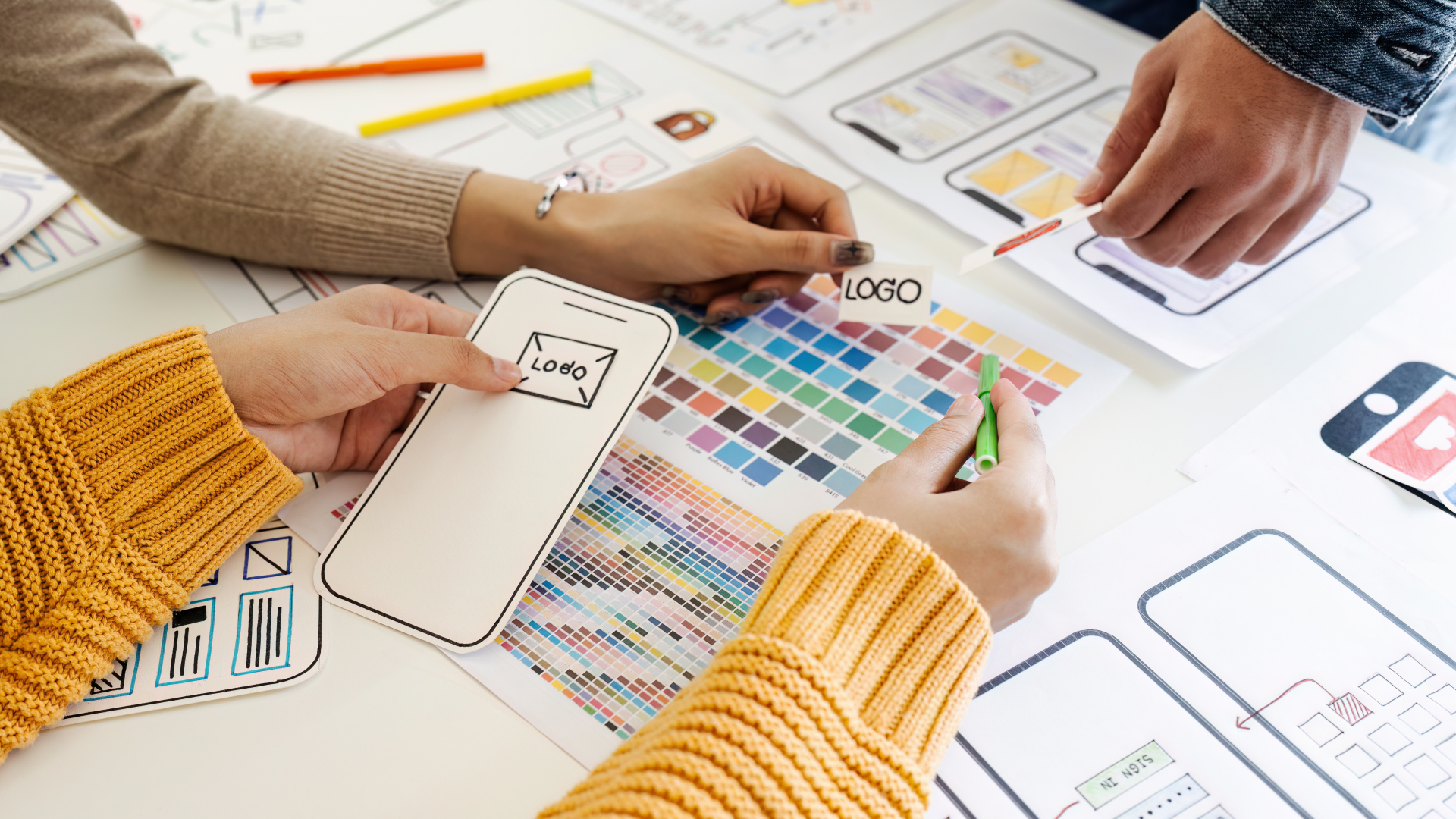
The Psychology of Colors in UI Design: Creating an Emotionally Engaging User Experience
Feltöltés dátuma:
In the world of User Interface (UI) design, aesthetics play an important role in user engagement and overall satisfaction. One of the most powerful tools in a UI designer's toolkit is color. Colors have the remarkable ability to evoke emotions, convey messages, and influence user behavior. Understanding the psychology of colors in UI design is essential for creating interfaces that resonate with users on a subconscious level. In this article, we'll explore how different colors impact user perception, emotions, and decision-making in UI design.
Color and Emotion in UI design
Colors have a profound impact on human emotions. They can evoke specific feelings and associations that can significantly influence how users interact with a website or application.
Red is a color associated with passion, energy, and urgency. It can be used to draw attention to critical elements like buttons, alerts or error messages. However, it can also evoke a sense of danger or caution if overused.
Blue is often linked to trust, stability, and calmness. It's a popular choice for corporate websites and social media platforms. Lighter shades of blue can create a sense of tranquility, while darker blues can convey professionalism.
Yellow is a cheerful and attention-grabbing color that can evoke positivity and optimism. However, excessive amount of yellow can be overwhelming.
Green is associated with nature, growth, and health. It's commonly used in apps related to the environment, health, and finance. Darker greens can signify wealth and stability, while lighter greens convey freshness.
Purple is often associated with luxury, creativity, and spirituality. It can be used to give a sense of sophistication and elegance to a UI.
Orange is a color that exudes enthusiasm, energy, and warmth. It can be used to create a sense of urgency or draw attention to specific elements.
Black is often associated with sophistication, power, and elegance. It's frequently used in luxury brands' UI design to convey a sense of exclusivity.
White represents simplicity, purity, and cleanliness. It's commonly used for minimalist designs and can create a sense of spaciousness.
Color Harmony and Contrast
While individual colors have specific psychological associations, the way they are combined in a UI design is equally important. Designers should consider color harmony and contrast to ensure that the interface is visually pleasing and easy to navigate.
Color Harmony
Complementary colors (opposite colors on the color wheel) can create visual harmony when used together. For example, blue and orange or red and green. Analogous colors (colors adjacent on the color wheel) can create a calming and unified feeling in a design.
Contrast
Contrast is crucial for readability and user engagement. Text should have enough contrast with the background color to ensure legibility. High contrast between call-to-action buttons and the background can draw users' attention.
Cultural Considerations of Color Theory
It's essential to remember that the psychological impact of colors can vary across different cultures. What is considered positive or negative in one culture may be perceived differently in another. Therefore, international UI design should take into account cultural preferences and interpretations of colors.
Accessibility and Inclusivity
Another critical aspect of using color in UI design is ensuring accessibility for all users, including those with visual impairments. Designers must consider color contrast, provide alternative text for color-coded information, and adhere to web accessibility guidelines to ensure that the UI is usable by everyone.
In UI design, the psychology of colors is a powerful tool for creating an emotionally engaging user experience. By understanding how colors influence emotions and user behavior, designers can make informed decisions to create visually appealing and effective interfaces. However, it's essential to consider cultural differences and accessibility to ensure that the UI design is inclusive and caters to a diverse audience. Mastering the art of color psychology in UI design can lead to more engaging, user-friendly, and successful digital experiences.
Sign up for our newsletter!
Sign up for our newsletter to be the first to know about our latest projects and technological innovations.
Predicting Trends and Demand: The Power of AI in Inventory Forecasting
Inventory management is a critical aspect of any business, influencing costs, customer satisfaction, and overall profitability. Traditionally, inventory forecasting relied on manual methods and historical data analysis, often resulting in inaccuracies and inefficiencies. However, with the advent of Artificial Intelligence (AI) and machine learning, businesses now have powerful tools at their disposal to predict trends and demand with unprecedented accuracy. In this article, we'll explore the transformative power of AI in inventory forecasting and how businesses can leverage these technologies to optimize their supply chain operations.
Navigating Regulatory Compliance and Legal Considerations with Utility NFTs
As utility Non-Fungible Tokens (NFTs) gain traction across various industries, it's crucial for developers, businesses, and users to navigate the legal landscape and ensure compliance with regulatory requirements. While utility NFTs offer innovative solutions for ownership, access control, and digital asset management, they also pose legal challenges related to intellectual property rights, securities regulations, data privacy, and consumer protection. In this article, we'll explore the key legal considerations and regulatory compliance issues associated with utility NFTs and provide guidance on how to navigate them effectively.


